Introduction
This case study highlights the branding, identity, and website development for Azeum, a premium ground transportation company committed to high-end, reliable, and efficient mobility solutions. The rebrand combines minimalism with sophisticated design to reflect Azeum’s luxury and dependability, creating a cohesive and impactful visual identity across all platforms.

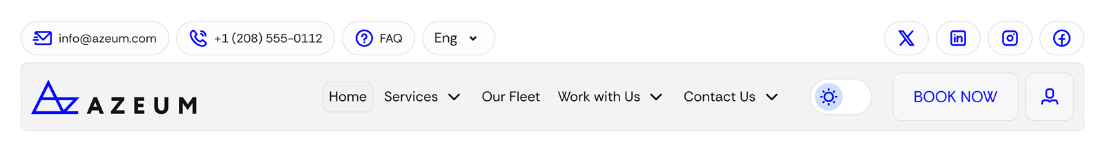
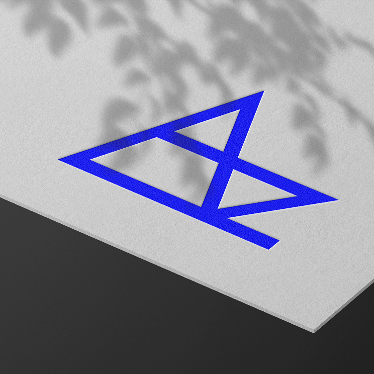
Logotype
Logo is the most recognizable element of brand identity. Inspired by movement, precision, and excellence, it visually represents the seamless transportation experience they provide.
The combination of the "A" and "Z" in logo reflects the concept of "Ground Transportation from A to Z," symbolizing their comprehensive approach to mobility.
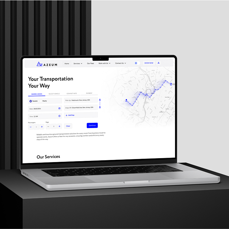
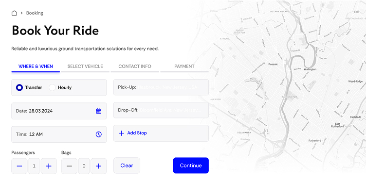
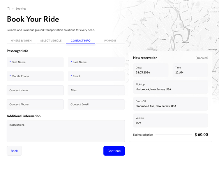
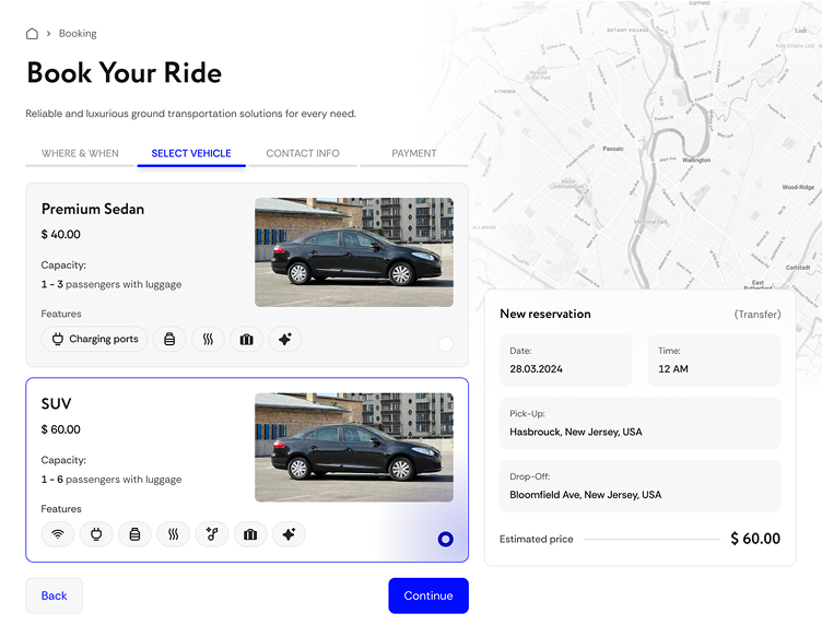
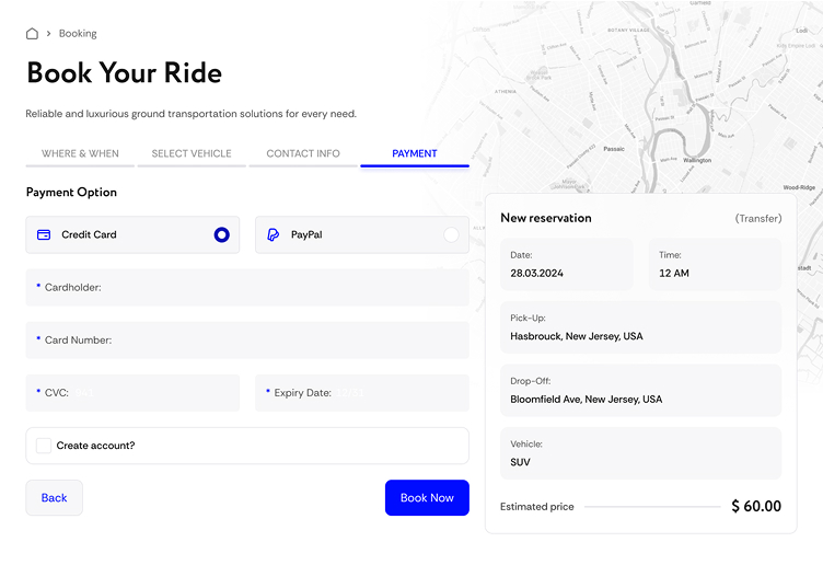
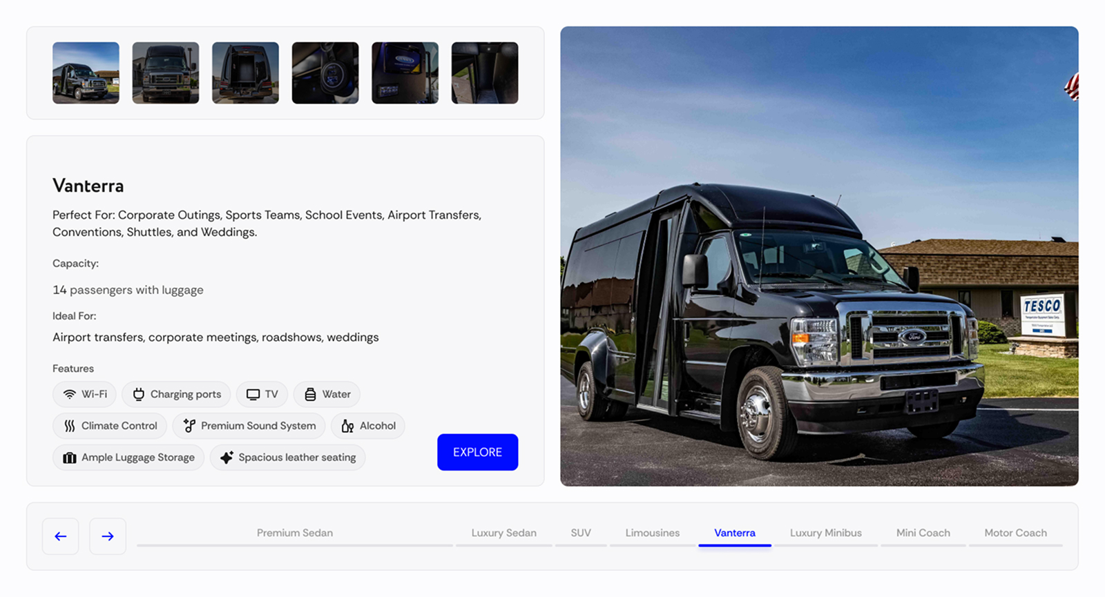
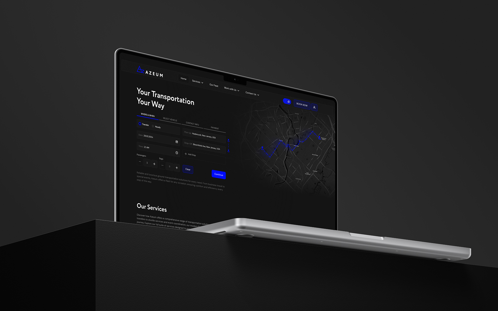
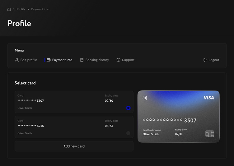
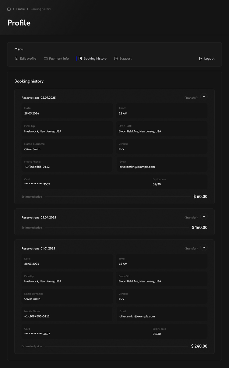
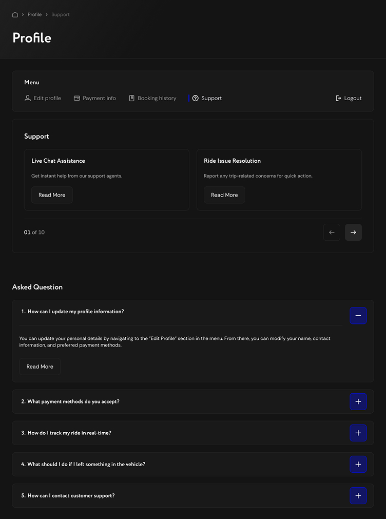
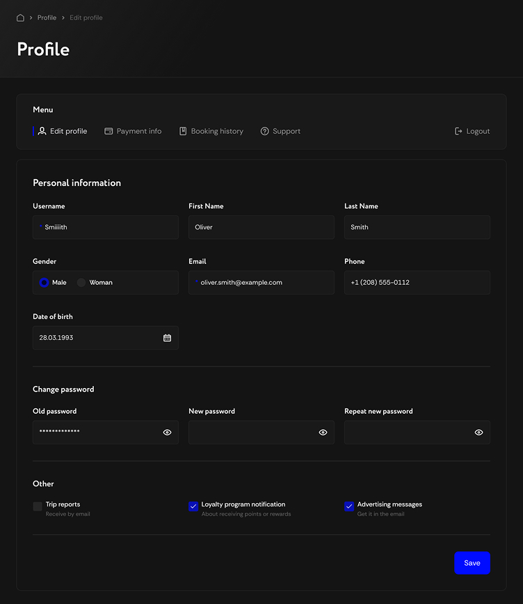
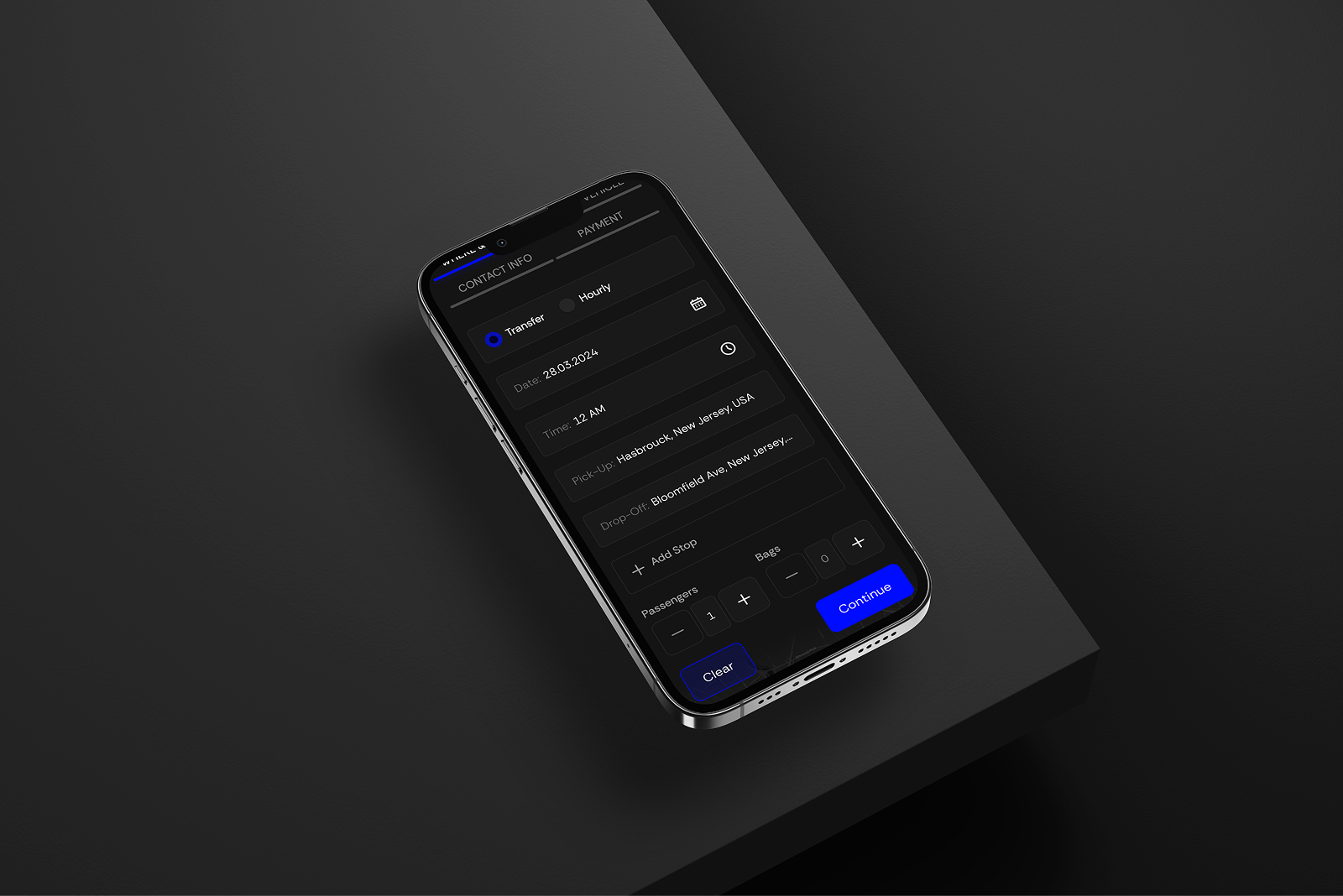
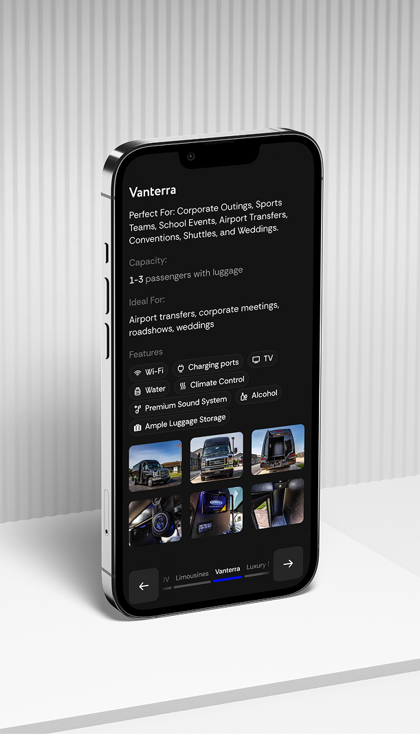
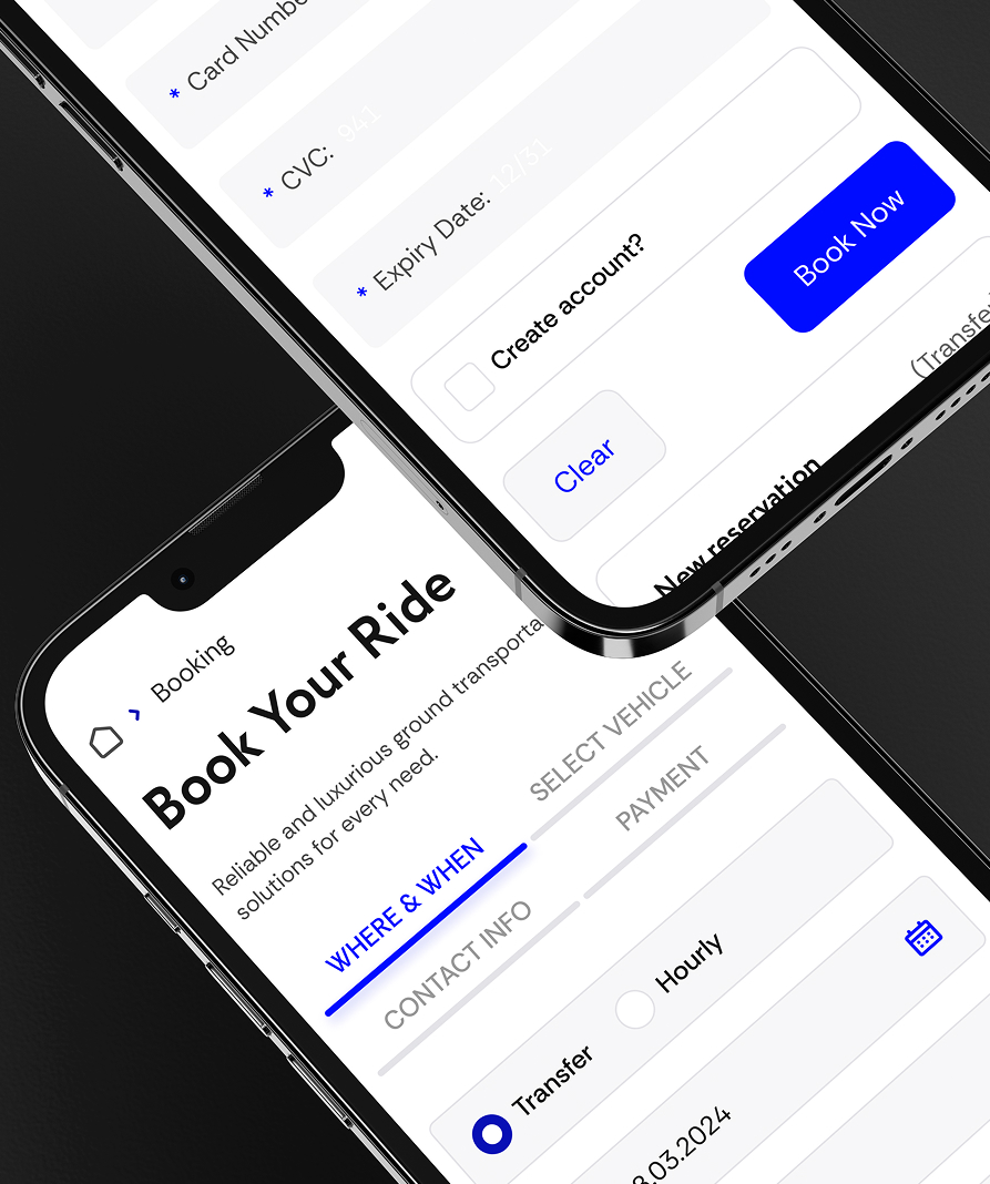
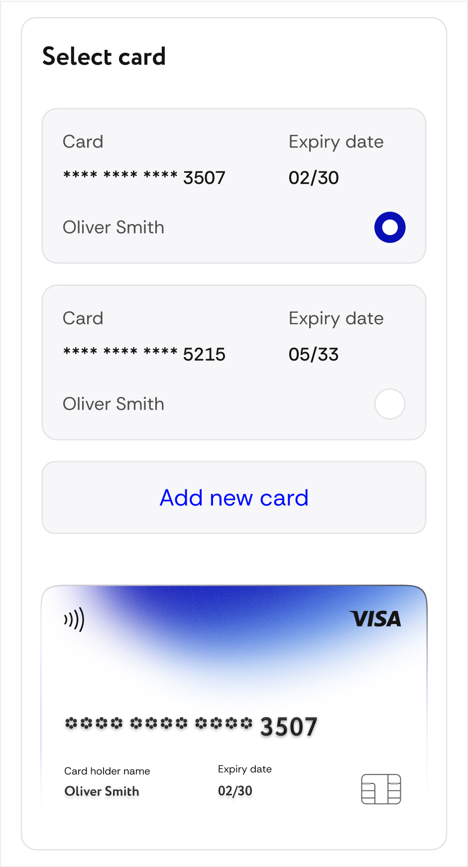
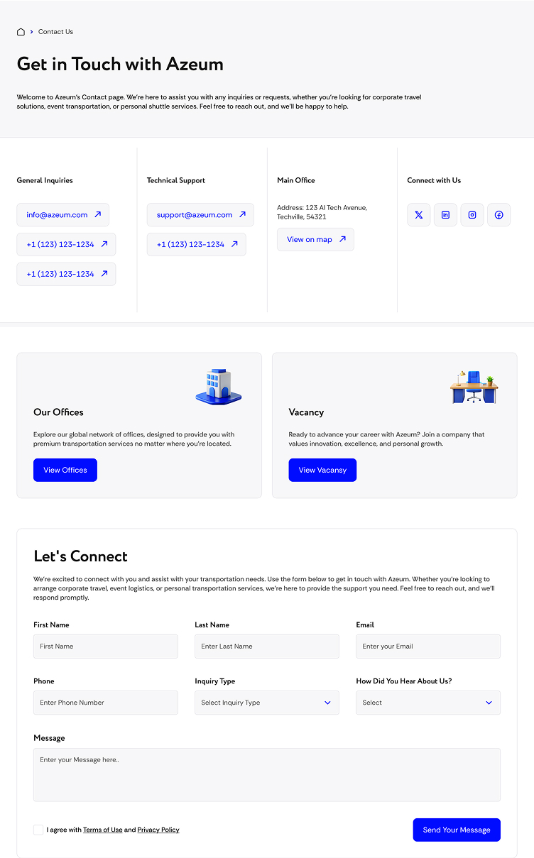
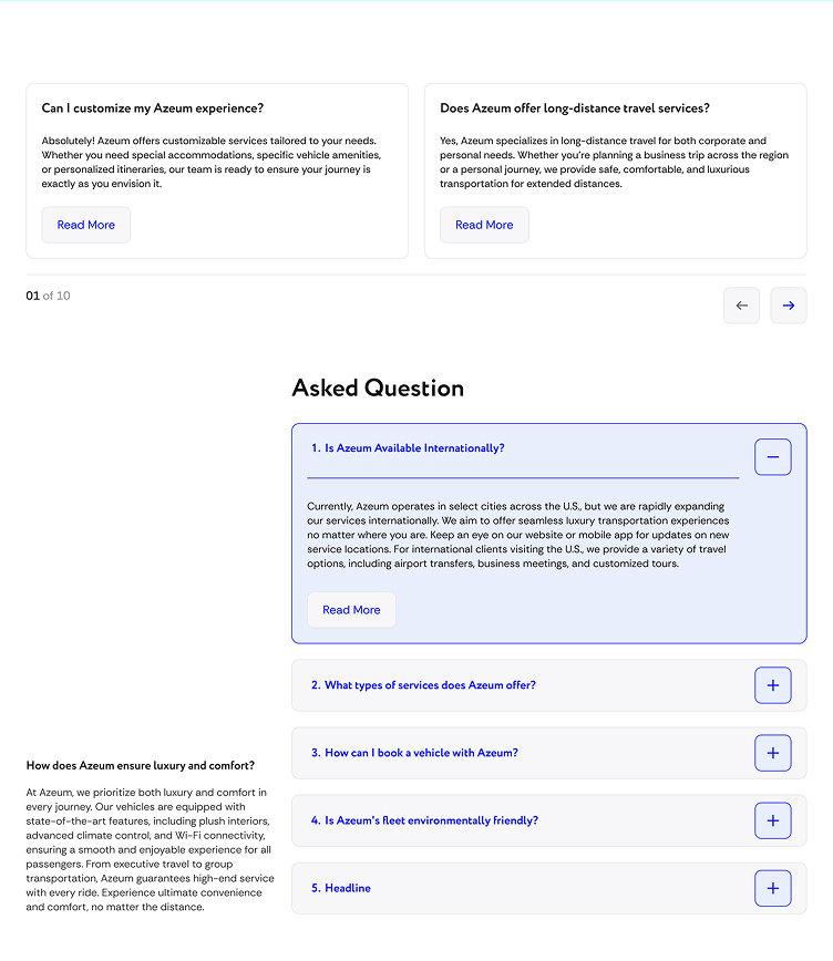
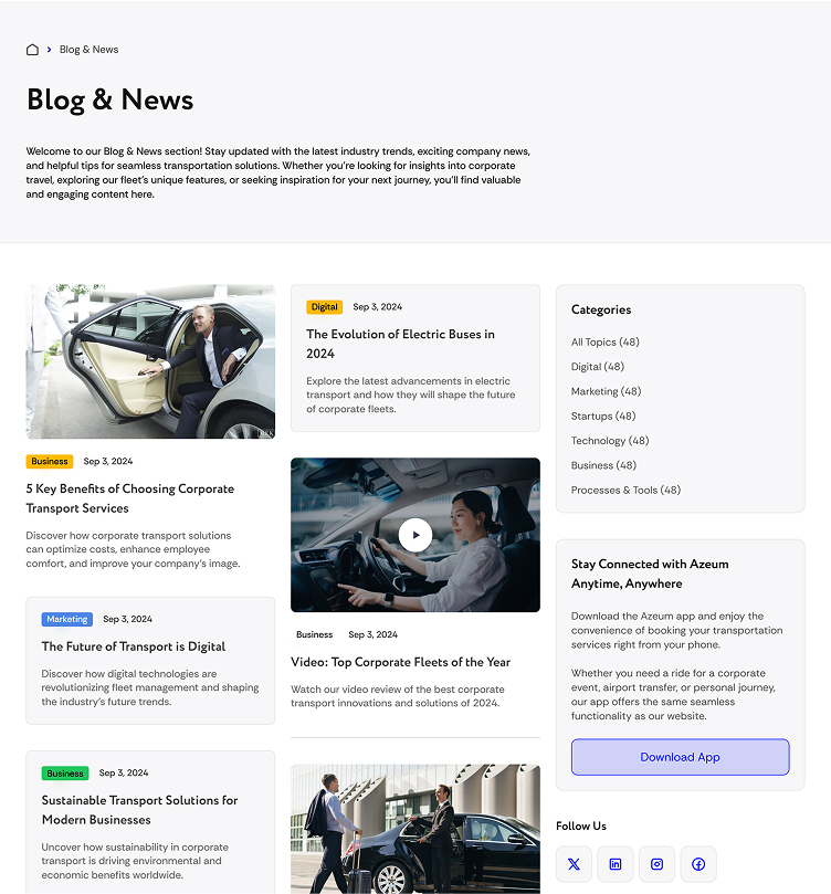
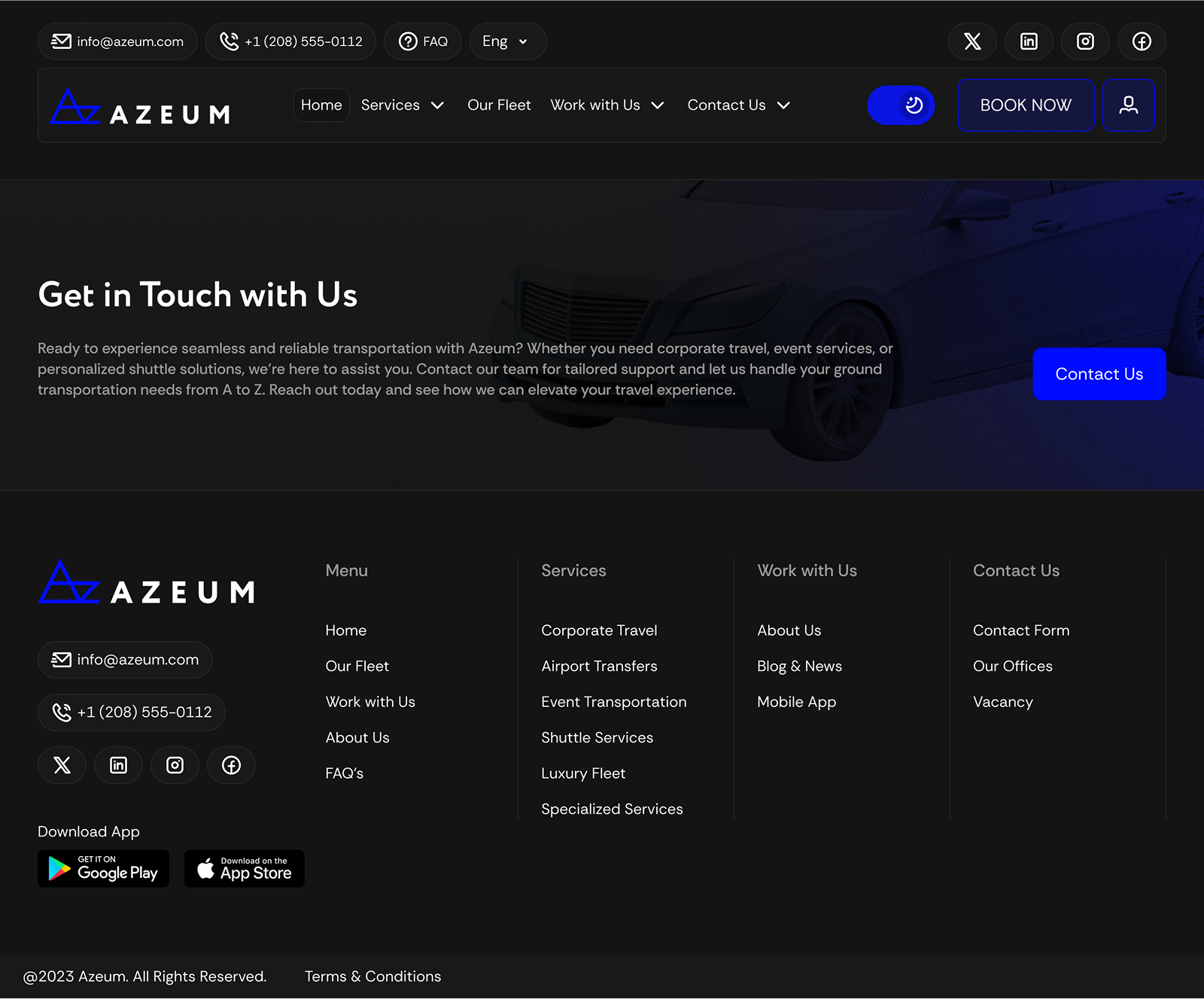
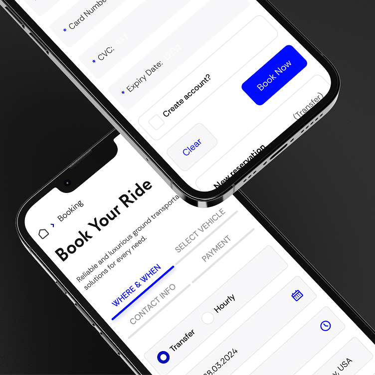
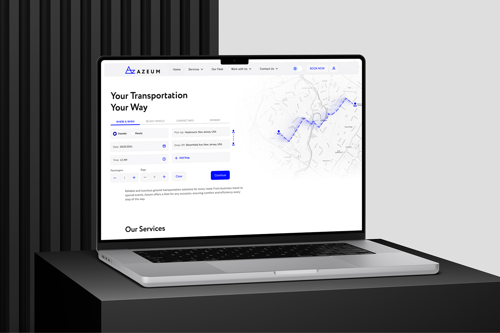
Website Development
Desktop / Mobile
Light / Dark
The Azeum website was developed from the ground up to provide an intuitive user experience. With full responsiveness for desktop and mobile devices, the site adapts effortlessly to different screen sizes. We implemented dark and light theme options, allowing users to personalize their browsing experience while maintaining a sleek, modern aesthetic.